share this post on
Do you want to learn more about how to influence behavior with digital products?
read our full whitepaper 
Human decision-making is flawed; we frequently make choices that are against our best interests. In this article, we will discuss how to design choices that subconsciously nudge people to make the right decisions for their health.
Heuristics and biases: mental shortcuts that simplify a messy reality but can lead us astray.
Our Automatic System takes mental shortcuts to solve problems because the number of mundane daily decisions we have to make under some level of uncertainty is extremely high. Most of the time these shortcuts lead to acceptable results but they also produce systematic errors of judgment, and irrational decisions. We call these systematic errors cognitive biases. In order to successfully implement nudges, we need to know about possible “thinking traps” and turn them to our advantage.
Cognitive Bias: Systematic errors of judgement made by our intuitive thinking in order to simplify decision-making processes. While these shortcuts may have worked well in prehistoric times, they are not always effective in modern society.
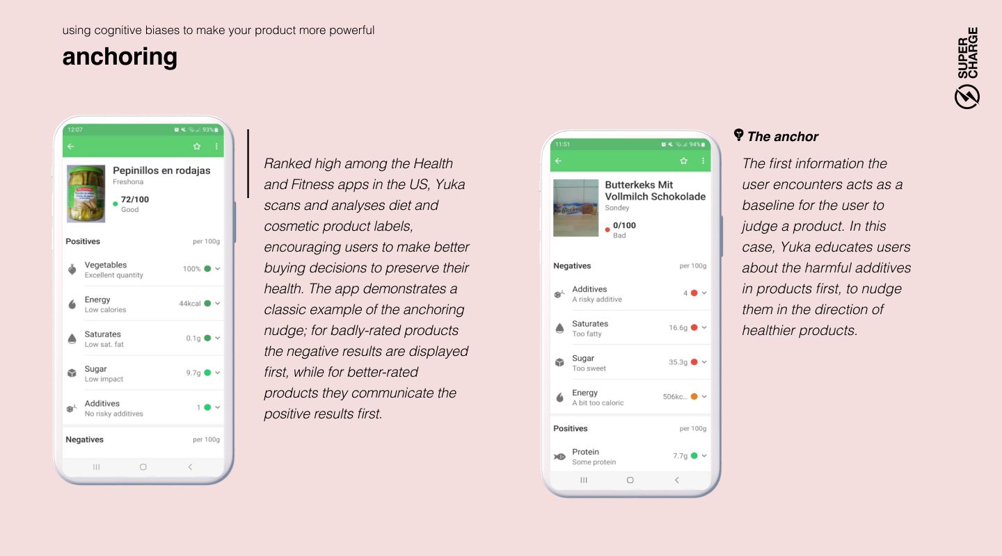
Anchoring, or the dominance of the first information, has an important role in creating nudges. Humans need a starting point to begin our thought process, and we use the first information we receive or remember as a springboard for our subsequent ideas. That’s why the expensive cars are placed at the front of the showroom: after you see their price tag, everything else will seem cheap in comparison. Anchors aren’t necessarily numbers: if the first information you hear about a doctor is that their last operation wasn’t successful, it will be hard to restore your confidence in their skills — even if they have the best track record in the city.

Lead with what matters: The first piece of information you give your customer will hold the most influence over their decisions. Lead with the one that is most likely to nudge them in the right direction. Build the narrative of your digital journey on a strong first impression and make sure that everything that follows reinforces it.
People tend to think statistics won’t apply to them. For example, when confronted with commonly shared statistics like “40-50% of US marriages end in divorce” or “staggering 80% of restaurants fail within the first five years of operation”, we assume this won't happen to us. It's not because we are oblivious to statistics; when surveyed about average chances, people are usually quite accurate. Yet, they estimate their own chances of success as exceptionally high. The rationale? Mostly just “I am me, and they are not.” This has a definite upside: without this unfounded optimism, there would be no new restaurants to sample. Evolution prefers those who take initiative, even when the odds are stacked against them.

Make risks feel personal: This type of nudge is extremely important in healthcare products, as customer overconfidence unfortunately also applies to risk-taking. People who engage in harmful habits (such as smoking, unprotected sex, or a diet mostly consisting of processed red meat) are usually aware of the risks associated with their activity. They just think the statistics don’t apply to them and they are magically immune to harm. The solution? Focus on subjective experiences (read on for the availability bias) instead of statistics. Boring numbers leave people unmoved.
The availability bias describes how we assess the likelihood of an event based on how readily examples of the event come to mind. When we assess the risk of being attacked by a shark in Australia, we base our calculations on what we’ve heard. If you’ve read a few shocking articles about shark attacks, you perceive the risk as quite high. In reality, cycling in Australia is 50 times riskier than swimming in the sea. Your guesstimate will also depend on how much the given event captivates your imagination or frightens you (that’s why people often overestimate the frequency of plane crashes), and how recently you heard about such an event.

Don’t be afraid to be dramatic: When you want to make sure people take a health risk seriously, use tools that evoke emotion. Simple statistics about heart attacks might be forgotten in a second, while a terrifying video will burn into the viewer’s mind. Our Automatic System remembers and increases the perceived risk in question.
Keep information at the forefront of the mind: Intentions to act more wisely often wane as the memories of the initial trigger fade. Users require well-timed reminders and refreshers to stay on track.
The average person is more afraid of losing something than excited about gaining the very same thing. On average, we are only willing to risk losing $100 if we have the chance of winning $200, and this 2:1 ratio in favor of loss aversion seems to be a constant value in different experiments. This behavior, from a probability perspective, is irrational, underscoring the human brain's indifference toward mathematical calculations.

A little scare can tip decisions: While modern marketing communication usually advocates concentrating on the value and the upside, we shouldn’t forget the power of loss aversion. To persuade people to follow the “smart path”, we have to highlight the possible losses that can occur if they do the opposite. But highlighting doesn’t mean showcasing risk statistics. It means explaining the possible loss in a way that captivates users’ imagination. It’s worth noting that it takes a careful design process to leverage this principle without causing unnecessary anxiety - especially in a field that can already cause high stress for patients.
It takes more effort to change something than to leave it as it is. Change involves more deliberation and unpredictability, and occasionally involves some actual legwork as well. Our energy-conserving brains tend to avoid it. This inertia is a powerful force, recognized by many designers. Freemium apps entice users with free trials, hoping they'll neglect to cancel their membership. Reality is even starker: users often don't forget to cancel, but would rather pay than exert effort to alter the existing situation.

Include defaults that create the most benefit: There is a significant advantage to be gained from this powerful tendency for humans to do nothing. We can design smartly set defaults. No matter whether you are working on a digital product or a policy, people will likely just go with the default option. For example, in countries where organ donation in case of accidental death is an opt-in program, only 10-15% of the population registers for it (like when you order your NYC ID). In contrast, in countries where it is an opt-out program, more than 90% give permission. That's a massive difference. You can expect similar results in your products regardless of the context. Of course, keeping certain choices opt-in is legally mandated (like newsletter subscription), but in many cases, the decision lies with the product’s owner, and the option to nudge people in the right direction is there for the taking.
Framing essentially means that the exact same information can have a very different effect on your decisions depending on how it’s presented to you. This bias is so powerful that even experts fall for it sometimes. Test it for yourself: a “70% fat-free” yogurt sounds much healthier than the “30% fat” version, even though these are exactly the same. The statements 'After the operation, 9 out of 10 patients are able to keep the affected tooth in the long run' and '1 out of 10 patients will lose the affected tooth within three months of the operation' convey identical odds. Yet, the former sounds reassuring, while the latter instills alarm, often influencing decisions about undergoing the procedure. This is largely due to the brain's preference for energy conservation; our Analytical System is seldom triggered to scrutinize these statements mathematically.

How you frame options profoundly influences decision-making: To make a choice more attractive communicate it in a way that evokes positive images and emotions. If you want to steer people away, make it look riskier. You can do all of this by simply phrasing the truth differently. Of course, marketers have long known that the way we say things can significantly influence consumer choices (as embodied in McCann's 'Truth well told' slogan), but behavioral science reaffirms that framing significantly impacts even the most serious, data-driven decisions. As caring for our own health is full with choices that necessitate long-term, probability-based thinking, it's vital to consider how the way you present an option affects emotional responses. Even when you’d expect the ensuing decision to be a very analytical, data-based one, you might find that no one actually bothers to look at the math.
There are occasions when we instantly realize the need for thoughtful decision-making and our Analytical System quickly grabs the wheel to take control. No one tries to solve a quadratic equation based on intuition.
But in several cases we just do things on autopilot and deliberate consideration never actually happens. Most of our thousands of daily micro-decisions are made this way, bringing totally satisfactory results.
This autopilot state is called mindlessness.
Mindlessness only becomes a problem when we don’t recognize that a situation requires careful consideration and the decision we make with our Automatic System results in suboptimal choices.
It all starts with accepting the users’ lack of care. We can’t just expect that people will engage with our product in a mindful way. As harsh as it may sound, you can safely assume that people won’t care much about the details of your product and just want to get the benefits with as little thinking as possible. They will click through without reading the instructions and glance over important information.
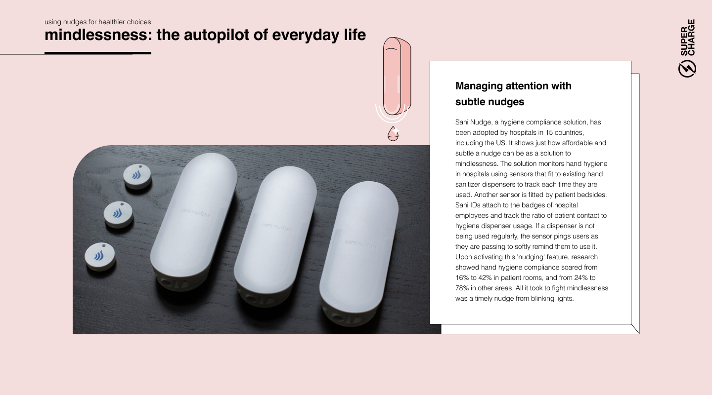

Train people when and where they care about it. Make sure that anything users have carelessly dismissed can be found and checked again, preferably in the context where it’s needed. It's preferable to explain a function at the point of use, not during onboarding. Users only pay attention to information if it appears immediately necessary for achieving their goal.
No matter what you do, there will always be errors caused by mindlessness. Expect errors coming from lack of attention and help people recover from them easily. It’s not because users are dumb: they just don’t care enough to put too much cognitive effort into operating your product.
Let the user interface (UI) do the heavy lifting. The right UI can effectively guide users who click around in a mindless state by utilizing signifiers and well-crafted information architecture, as well as leveraging existing mental models and biases like the ones outlined in this report. A well-designed UI created by skilled Interaction Design experts and supported by proper usability testing can nudge inattentive users in the right direction.
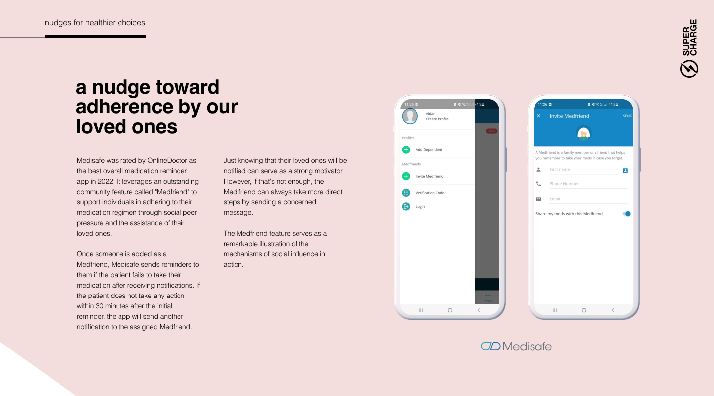
Our brain evolved to its level of sophistication mostly to facilitate social interactions and cooperation. We dedicate an immense amount of energy to consider what others might think, and running mental simulations to imagine how they would respond to our possible actions. Social relations are so important to us that, when our basic biological needs are met, most of our higher-level goals and motivations revolve around them, such as pursuing status that can only be understood in a social context.
If enough people say something, we tend to agree, even if it invalidates our own objective perception. Imagine how easily we succumb to conformity when discussing subjective matters.
We don’t just affect each other on a conscious level: we influence others (and are being influenced) constantly without our knowledge. These unconscious social effects can be leveraged in product design with great results.
We can even be convinced by others to not believe our own eyes. In a famous experiment, participants were asked to compare the length of sticks. In 20-40% of the cases, a group of random strangers (research assistants in disguise) were able to change a person's mind about their judgment by unanimously voting for another option, even though their own senses told them otherwise. Invisible peer pressure is a formidable force to reckon with.
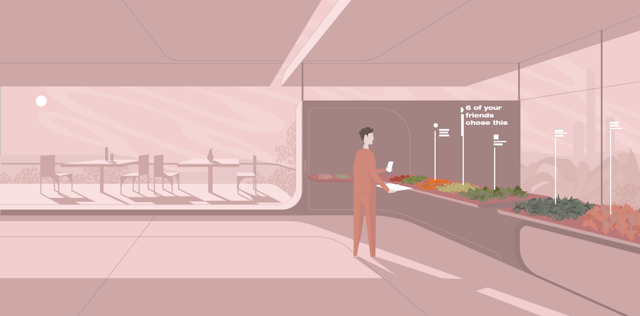
Showcase the smart decisions of others. Leverage the tendency to conform to steer people toward smarter decisions with a little digital peer pressure.


Our brain becomes most confused when faced with complex dilemmas. The complexity increases with the number of alternatives and factors that need to be taken into consideration. It's easy to choose between two painkillers if they have the same qualities except one of them lasts longer and is a bit more expensive. It’s a personal outcome that we can easily imagine: “I have less money in my pocket, but my pain is gone for longer.”
However, when you need to choose from 15 different painkillers and you are considering a multitude of factors such as strength, effectiveness for different sources of pain, potential addictiveness and side effects, brand reputation, and recommendations from friends the decision becomes overwhelming. To resolve this, you tend to go with your intuition. In situations like this, the right nudge in the right time can steer customers towards more beneficial decisions.
In a market economy, we take it for granted that it’s good for customers to have as many choices as possible. However, experiments show that’s not really true: we are generally happiest when presented with a few well-structured choices. We usually don’t like it if one option is forced on us, but too many choices can lead to decision paralysis.
Have you ever wasted 15 minutes in a supermarket, baffled by the bewildering number of fabric softeners? That’s why some brands are so successful – they transform a hopelessly complex analytical decision into a simple, emotional one.
People follow different decision-making strategies: Maximizers want to make sure they pick the best possible solution and are anxious about missing out on something that might be even better. No wonder they are especially paralyzed by a wide array of alternatives. At the other end of the spectrum are Satisficers, who have a somewhat easier time, as they are fine with settling for a solution that is “good enough”.
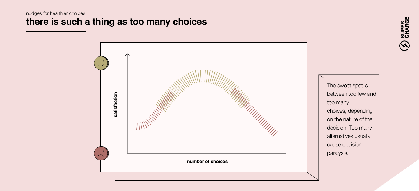
In a complex world where people are already overwhelmed with information, simplicity needs to be a primary goal of digital product design. More is not always better: aim to cut down the number of possible choices to simplify decisions. This is a true balancing act as people will have less opportunity to customize your solution — but product creators usually grossly overestimate the amount of customization people actually want. Simplifying decisions isn’t just good for the customers, it’s also profitable: in a famous real-life experiment, consumers faced with too many varieties of jam flavors started to buy less of it.