
share this post on


When digital meets physical: how to craft frictionless products in a new, blended reality
Tackling the conundrum of future experiences
21 April, 2021
“We become what we behold. We shape our tools and then our tools shape us.” A quote commonly attributed to media philosopher Marshall McLuhan that refers to the symbiotic relationship humans have developed with their tools.
By today, our tools have evolved to include a hardware and a software component, with each part having an equal impact on the product’s usability. The experience of using a certain tool fundamentally defines our relationship with it. As a result, this very experience has a huge impact on the product’s eventual adaptation into our life.
So, how can we make sure both components are designed to support the same experience? How can we create products that are successful in the digital and the physical sense alike?
In this blogpost we will look at situations where humans interact with both the digital and the physical component of a product or a service to provide some insight into why certain solutions work (and why others don’t) from a user’s perspective. Furthermore, we will introduce three fundamental approaches to guide the design and development of such products.
We live in a brave new blended world
Over the last decade digital products, services and tools have been transforming the way people live through the ever more powerful computers on our hands: our mobile phones. Society has moved from the production of material (physical) goods to the production of information and digital services, which resulted in creating new methodologies and practices for designers and innovators.
We are now in the middle of another shift: the digital element is not only shaping the virtual world, but also starting to have an impact on how physical products are designed.
This shift is promoted by technologies like AR platforms, NFC tags or QR codes, which are gaining traction with more and more applications on the market that blend an element of the virtual world with a physical factor. Even taking a step back, we can clearly trace the trend of mechanical buttons being replaced with touch screens and an increasing number of products having been launched with a supporting phone app.
It’s enough to look at the extent digital elements have been almost seamlessly incorporated into our daily routine: video chatting with our families, ordering food, planning a trip… the list could go on for pages. This trend has been supercharged by the recent Covid pandemic as digital solutions started to act as safe havens for societies trying to minimise physical interactions. During this past year even digital laggards – businesses and people alike – have been forced to rapid adaptation by the virus.
This ultimately proves that people don’t make the mental distinction between solutions offered by the digital or the “real” (as in, physical) world anymore. They simply choose the tool that best helps them fulfil the need or task at hand: communication, hunger, navigation.
Let’s consider an everyday example: it’s early in the morning and you are in the middle of your daily commute to work. You feel like it wouldn’t hurt to charge your batteries ahead of a big day, so you enter a coffee shop. You gaze at the counter’s display, maybe even look up on your phone that new coffee type you’ve never heard of. All of a sudden you are next up in the queue and at the heat of the moment you end up ordering the same as usual: a pumpkin soy latte.
It’s time to pay and you have a choice to make: cash or card? You immediately reach for the tool at hand that you feel most comfortable with (or that is available), which in the current pandemic situation ends up being your phone. Regardless of your mobile’s operating system you place it near the terminal that scans it, then wait for the transaction to be confirmed.
This confirmation can be derived from multiple sources: the cashier’s nod or smile, the success message on the POS terminal’s barely visible screen and possibly the familiar vibration of your phone as the notification arrives from your bank. The cashier might hand you a slip, but you can also find evidence of the transaction in your mobile bank.
Throughout the process of paying you never actually stopped to think whether the nature of the interaction was digital or physical, albeit it would have been easy to identify very distinctive phases where you used a digital interaction (unlocking your phone/authenticating the purchase) or a physical interaction (like placing your phone near the terminal and holding it there).
How to design products that blend the physical and digital with no friction?
This article states that from the user’s point of view an action is not viewed as a “virtual” or a “real-world” one.
The decision of whether we interact with a tool via a digital channel or in a physical manner is not conscious. Instead, the means we choose to carry out a particular action is dictated by the comfort, experience, availability and affordability of the tool, not to mention our familiarisation with it.
So how can we address these factors when designing services that include both physical and digital aspects? Luckily, there are a handful of approaches we can follow that could help us craft interactions that make sense: interactions with good, solidly integrated experiences. The following three points will elaborate on each approach and show you some good solutions (and a few less fortunate ones) from the current market to illustrate it.
1. Not every interaction should require the same level of attention
As life is getting more demanding and hectic, users try to cope with it by multitasking. But are we really capable of doing so?
Human attention is like a spotlight. It can only focus or bring light to one area at a time. We can jump between things in a matter of a split second, but it will be just that: jumping. We can also zoom in on small details (by moving the spotlight closer) or concentrate on the big picture by illuminating a larger area but with less clarity (by taking the spotlight farther away). This phenomenon is perfectly portrayed by the selective attention experiment. So, let’s just keep this in mind while thinking of new physical products with embedded digital services.
If the user’s attention needs to be split between interacting with the physical world and interacting with a digital element at the same time, a clear order of priority needs to be defined. Furthermore, we must adjust the level of interaction accordingly, in terms of time and intensity necessitated by each component.
This point is easily illustrated by a car accident caused by a driver who was simply trying to adjust the speed of his car’s windscreen wipers. Although the wiper itself could be turned on and off from the steering wheel, its speed needed to be adjusted through the digital infotainment screen requiring substantially more attention and interaction.
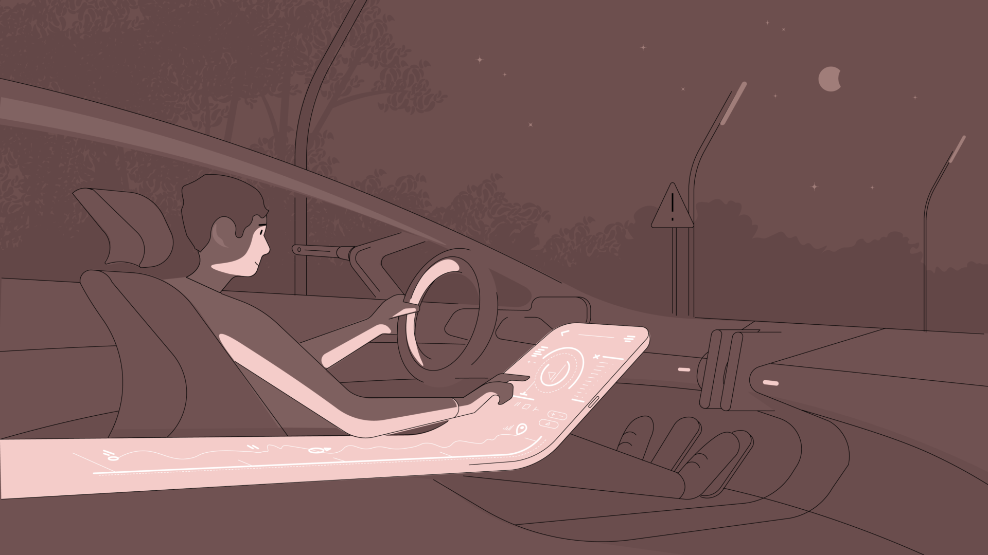
The driver was more focused on the touch screen’s navigation flow than on driving itself and (not surprisingly) this led to a crash. The amount of interaction necessary for a very important feature was too much and too complicated. This case actually led to a local court in Germany ruling the infotainment screen to be an electronic device (same as a smartphone) and as such, prohibiting its handling while driving.
In other situations splitting the user’s attention like this might not have such devastating consequences, but usually, the effect of an interaction in the physical world is less revocable or undoable than that of a digital interaction.
A contrasting example is the touch screen built into modern DSLR and MILC cameras, through which users are now able to control and interact with their equipment. Even so, the minute you look through the viewfinder, the screen (usually) turns off. It effectively prevents casual touches from your nose or cheek while your selective attention is being focused on the scene to shoot, using a physical button.
2) How we interact with a tool depends on what we know about it
Let’s take a minute to think about the way we instinctively interact with our objects. Why is it that we grab or push some of them, while we pull or tap others?
It all lies in the relationship we have developed with these tools based on our previous experiences with them. This relationship stems from our understanding of each object (our mental model) and the perception we get when we look at them.
For example, we know without thinking that we can push a button on our laptop, as it is slightly raised from the surface and it’s designed to accommodate the touch of our fingertips. Similarly, a pair of scissors invites us to slide our fingers into its handle by having a specific form with finger-shaped holes.
However, this subconscious relationship can lead to painful moments too. Think about the last time you were stuck trying to open a door not knowing whether to push it, pull it or just wait for it to automatically open by dancing back and forth to activate the sensor.
Don’t worry, it’s really not your fault: most often it simply boils down to bad design. There are no carefully added clues to help you perceive how to use the object in question, or they don’t follow a pattern you already understand.
Our personal relationship with objects builds upon a lifetime of experiences through observation and, most importantly, hands-on experimenting. Being able to learn this complex information of each object is part of what makes the human race so successful, and the accumulation of this knowledge starts at a very early age. We look at what others do and how they interact with things and eventually we end up trying the same interaction to see if the effect is indeed, the same.
Our relationship with particular objects gets deeply engraved into our subconscious and that’s why we become so frustrated when something refuses to behave as expected.
In terms of digital products, the touch screen is quickly becoming our main tool of interaction: a flat piece of layered reinforced glass that senses the location of touch by the change of electrostatic field.
What’s important though is that subconsciously a touch screen is telling us that we can tap or slide on it, as it is a flat surface. If there is a button or another type of physical control at any point in the interaction, our expectation and understanding will change accordingly.
Modern toddlers provide the perfect example here: they have learnt how to interact with touch screens and now they are expecting every screen to behave in the same way. They march up to the TV and start poking it or try to swipe your laptop screen. Eventually, with the lack of feedback, they grow out of it and develop a more accurate understanding that these devices are controlled by buttons, which in turn need a different interaction.
Okay, but how does this story help you find the sweet spot at the intersection of digital and physical?
If you keep in mind that the perception and understanding of a product will differ across age groups, demographics and devices, you’ll be able to design intuitive products that – simply put – don’t make people go mad.
Let’s examine the interesting case of POS terminals in shops. There are so many different types sporting different configurations that people easily get confused as they try to place their phones (or cards) on top of them to use contactless payment. Then they proceed to try various other angles until the cashier points out the right area for that specific terminal. Sometimes, this area is the screen itself (inconveniently the same display that should give you feedback on the state of your transaction), sometimes it’s located right above the screen, or at an arbitrary place at the side of the terminal.
As the demand for contactless payment has intensified due to the pandemic, it’s time to look at this interaction and see how we could improve it. Wouldn’t it be simpler if you intuitively knew where to place your phone? If every terminal had an area approximately the size of a phone, positioned at the right height and tilted at the perfect “phone-holding” angle? It would certainly provide a good experience for customers, while it would also reduce the duration of the interaction and increase the efficiency of the checkout process. Definitely a win-win!
Card readers at the London Tube security gates are a good solution for this specific problem: the area of interaction is a bright yellow circle that is very distinctive from its context and is positioned at an angle to guide the position. The LED lights placed outside of this area are an added bonus, always showing you the state of the gate.
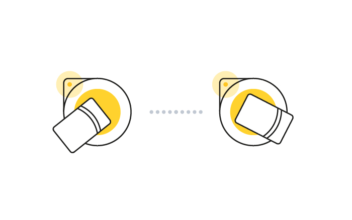
How to touch in and out using the London Tube security gates (Source: tfl.gov.uk)
With NFC technology gaining more traction and QR applications becoming ever-present, it is important to put emphasis on the area/space of interaction as well as the app interface, as both are integral parts of the whole experience and influence it very strongly.
3) Design for clarity and multi-level interaction
This one might be easier to grasp than our first two points, especially through these two keywords: feedback and redundancies. Obviously, both are well-known principles in UX design, but adding some sort of physical interaction to the mix makes it imperative to extend these guidelines to the tangible element as well.

Feedback: Physical tools are also becoming more complex and “smart” with digitalisation. Users handling them will need to know what the system is doing at any point in time, otherwise they will not understand how to interact with them. For every action there is a reaction (or effect) that should be communicated to the user. Importantly, this information should also be in sync with both the physical and the digital element – elseways users will panic and restart the application (since it’s clearly contradicting the physical state) or begin to aggressively punch random physical buttons in their misery. Feedback is an important part of every interaction model and if it’s lacking, users will feel perplexed about the consequences of their actions and learning how to handle new tools will become difficult.
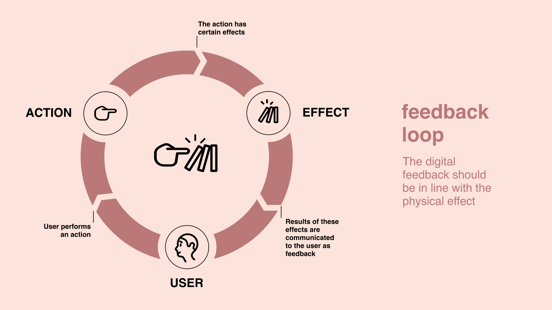
The feedback loop: the digital feedback should be in line with the physical effect
Redundancy: If the smart, digital interaction side fails for some reason (i.e., no connectivity or tripping up on a software update bug) and there is no other method to control or manually interact with the product, the frustration becomes real. These are the moments when we suddenly start to long for our trusty old analogue world. Redundancy is vital because it mitigates user errors and, in some cases, can even help avoid dangerous outcomes. Besides, it makes solutions more flexible, allowing users the freedom to tailor their usage to their individual needs and situations.
A quick example to illustrate: if you are out on a run and the touch screen of your smartwatch isn’t responsive because your fingers are sweaty, yet you have no other way to mark your lap time accurately… well, that pretty much leaves the “smart” out of the smartwatch, doesn’t it?
If the smart thermostat heats up your home without you ever instructing it to do so because it had a “glitch” in the OS, or if you need to recalibrate it after every OS update (taking several hours), your “smart thing” can lead to a really bad experience, mostly fuelled by the fact that you don’t really know what the system is actually doing.
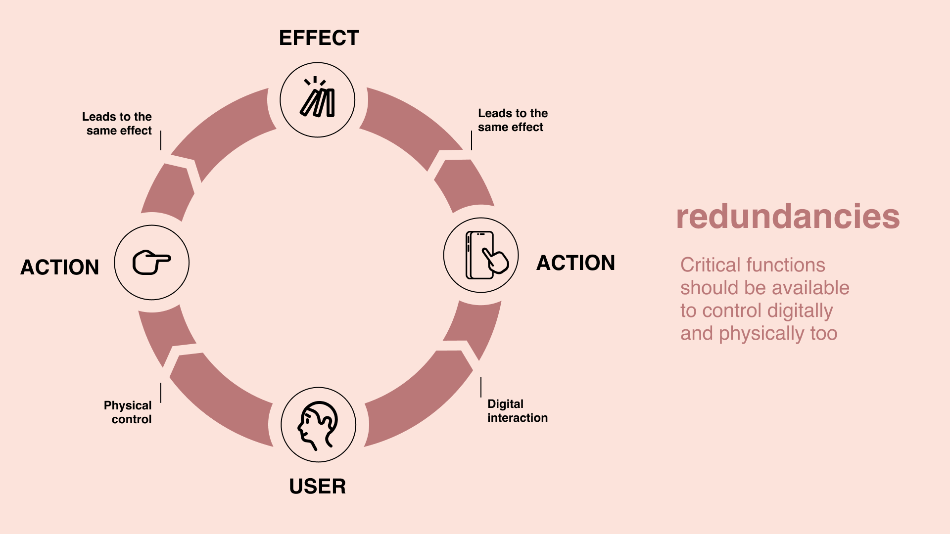
Redundancies: Critical functions should be available to control digitally and physically too
A blended reality requires digital and physical thinking alike
To conclude our examination of the intersection of digital and physical experiences, we can proclaim that we need digital products that are carefully designed to serve us well in this new, blended reality. Likewise, we need physical products that can accommodate and support the digital habits that have undoubtedly become part of our lives.
Designing a digital experience that includes certain physical elements in the interaction has to be meticulously planned: keeping in mind the varying knowledge users might possess about such devices and always in sync with the physical gadget itself.
This can only be achieved if we finally part with the notion of doing product development in silos.
Instead of the digital team working on the software part and the physical team leading the hardware development, we need a joint process with inputs coming from both teams in the spirit of co-creation.
Certainly, this is no easy task: right now we often see even digital teams being too fractured along technologies (backend, mobile, web, etc.), and throwing in yet another factor with the hardware teams doesn’t really help. But no matter how you look at it, our world won’t get any simpler.
We firmly believe that the way forward leads through intensive cross-functional collaboration and shared ownership among all teams to develop amazing products that can ultimately make life better for their users.


