
a banking platform paving the path to the future
The new OTP mobile bank isn’t just a cutting-edge experience - it’s a product that helped us catalyze a massive organizational transformation.

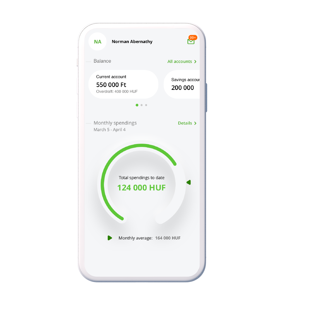


The new OTP mobile bank isn’t just a cutting-edge experience - it’s a product that helped us catalyze a massive organizational transformation.


OTP Bank - one of the largest bank groups in central Europe - realized that best-in-class digital competence must define their future, but turning a traditional banking org into an agile product development powerhouse required a fundamental transformation of the business.
A shift of this magnitude takes years to carry out, and OTP needed a partner to act as an innovation engine, providing extra momentum for their immediate strategies and product development needs.
As OTP’s innovation partner, Supercharge owned design and implementation the new digital experience for retail customers. We collaboratively developed a new, high-performing product that also functioned as a catalyst and training ground for the bank’s emerging digital division.
Once we had designed and built the MVP, we gradually handed it over to OTP’s internal teams while providing mentoring and guidance to set them up for success.

OTP’s desktop and mobile experiences had reliably served their customers, enabling them to remotely conduct their most common daily banking activities. While the experiences performed well, they were coming to the end of their lifecycle; they were comfortable tools for conducting transactions but couldn’t serve as the engine for future sales and innovation.
The bank wanted to find the next big thing and leveraged Supercharge to explore how the new platform could add the greatest possible value to their business.
Falling in line with the industry trend of financial institutions becoming ever more approachable and human-centred, we set out to drastically improve the UX and usability of their ageing platform.
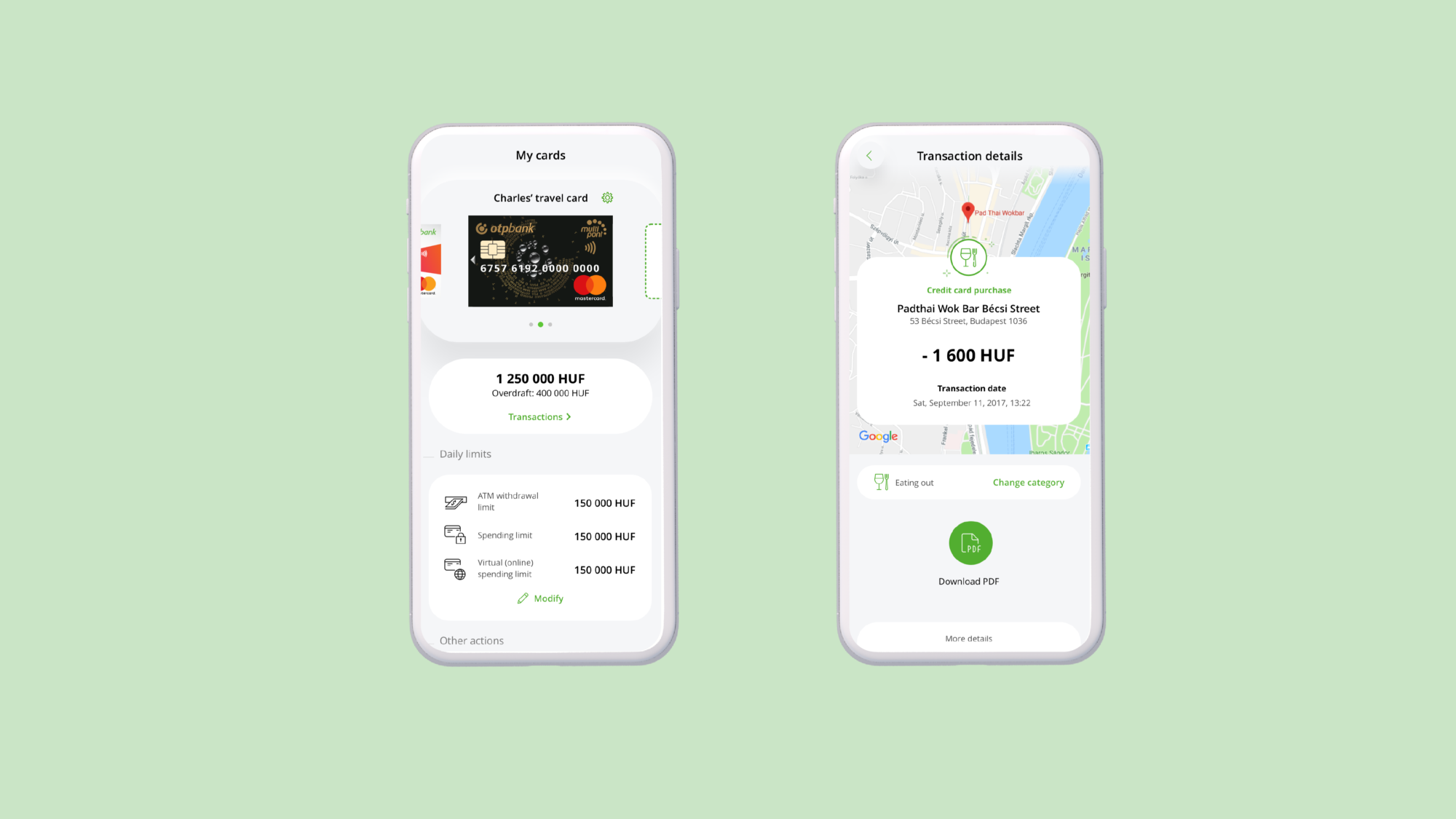
In addition to these base goals, we investigated areas beyond daily transactions: With branch visits becoming less frequent, we explored how a digital platform can take over the advisory and sales functions performed by human representatives, how it can be a tool for financial education, and how we can build a flexible platform to enable the fast-moving, agile product development setup the bank has envisioned.

Our solution was an omnichannel digital experience that goes far beyond just enabling transactions. Instead, we created a trusted digital advisor. Good advice must be personal and timely, so we created a fully modular platform that shows only the required information, only in the relevant context. This helps users answer their most crucial financial questions: what happened to my money… and what I can learn from that?
In later stages, the platform will increasingly target questions aimed at the future: what can I expect to happen based on my financial history? What should I do to make smart financial decisions that positively influence my future? In order to drive business and offer tangible value for the customers too, these insights link to flows that enable users to take immediate action and manage their finances in real-time.
The future of banking is mobile
We kicked off this project with a bold statement: “the future of banking is mobile.” Even if not all customers exclusively opt for mobile access, there is a growing segment that does. The mobile application can’t play second fiddle to the web version anymore. To drive this point home, we first designed every single feature for the small screen - delivering an experience where using the web is an option, not a necessity.
Designing the platform that would serve as the bank’s face for a future generation of customers required a visual language that tells the right story. OTP’s future is about relentless innovation and extreme focus on customer needs. We challenged ourselves to think “how might we convey this simply through user interface elements?”
The resulting visual world remains in line with the OTP brand, but three-dimensional membranes create a distinctly futuristic, yet soft and welcoming feel. The interface evokes technical progress – but a progress that makes us humans feel and live better.


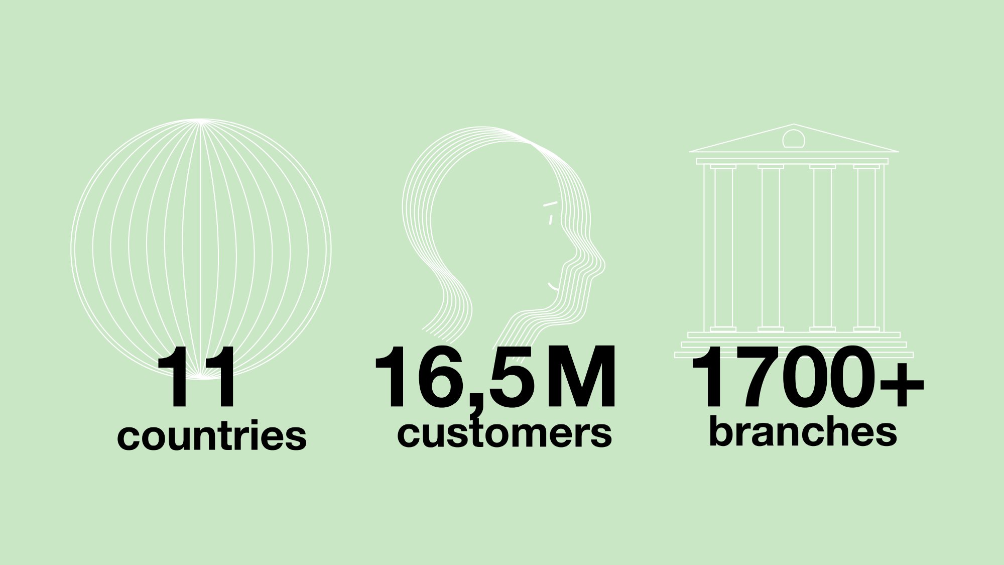
OTP is the dominant market leader in Hungary. Its 3 million retail customers come from every segment of society - bringing enormously varied backgrounds, goals, tech savviness, and financial know-how. Creating an experience that caters to so many different needs requires special design techniques that impacts everything from information architecture to copywriting.
Beyond differences in skills and financial habits, it is also essential to make applications accessible to those who live with disabilities.
We employed a continuous user research process with hundreds of customers - constantly evaluating not only usability, but also how our solution fit mental models and customer expectations. We conducted special tests, iterating the product until it worked perfectly with screen readers for the visually impaired. This, combined with context-aware personalized insights, has resulted in an experience that is scalable for a large customer base but still feels customized to individual user needs.
To transform into an agile product organization, our client didn’t just need to develop their organizational structure but also their IT landscape. As we progressed with the vision of the new platform it became increasingly clear that the current monolithic middleware servicing the bank’s digital channels won’t be able to power a radically new experience.
Besides being responsible for the implementation of the front-end experience, we were also heavily involved in defining and building the underlying micro-service architecture and its components.
This new distributed architecture provides the much-needed flexibility and scalability for future innovations. In an enterprise project of this complexity, feasibility is a two-way street: product features (push notifications, PFM, etc.) introduce new requirements for the underlying tech – while existing unchangeable elements (such as the core-banking system) influence what can be designed.
We were able to help the bank tread this fine line because our experts had a holistic understanding of product desirability and tech feasibility. To enable speed to market, we also created a roadmap that gradually expands the platform’s functionality as soon as the advancing back-end capabilities make it possible.

OTP had a clear goal in mind: building an organization that can continuously drive successful innovation while enhancing existing products through rapid release cycles. While Supercharge worked on the foundations of the platform, OTP was able to focus on how this immense shift affected their organizational structure, processes, and company culture.
When the new agile set-up had been finalized and we finished the design and implementation work on the 1.0 version of the platform, we began a gradual handover to the bank’s internal product teams. This process lasted for several months and it didn’t just include transferring design assets and source code: it was an intense mentoring and training period during which we made sure to set them up for future and ongoing success.
As the platform has rolled out to millions of OTP customers and we’ve seen an influx of heart-warming reviews, we feel incredibly proud to have supported the bank through this ambitious venture.
As OTP’s innovation partner, Supercharge crafted a ground-breaking product and helped to transform the entire organization to better service their digital channels in the years to come.
As the platform is being rolled out to millions of OTP customers and we see an influx of heart-warming reviews, we feel incredibly proud that we could support the bank throughout this ambitious venture.
As their innovation partner, Supercharge crafted a ground-breaking product and also helped to transform the entire organisation to become capable of rendering digital channels even better in the years to come.
share this post on